Thursday, September 27, 2012

Histoires de parfums: Olympia & Veni Vidi Vici


Histoires de Parfums goes to White fair and presents in Milan its news: Olympia, Veni, Vidi and Vici. The aim of this brand is researching new smells, out of the common paths. The choice of Histoires de Parfums is a matter of jus: every creation tells a different story, they like to call it olfactory library, and people can find, in some particular of them, similarities with their personal stories. If everything started taking inspiration from famous personalities of the past, such as Casanova, Verne, de Sade, Gérald Ghislain, the founder and nose of the brand, this year presents Olympia, the famous red-velvet-covered music hall in Paris, and Veni, Vidi, Vici, (I came, I saw, I won, in Latin) a triplet that takes inspiration from  Ceasar's famous mot. Veni, the unknow land, Vidi, the wind, the vision over the sea and over the mountains, Vici, the fire, the power, the passion and the expertise. All of them are a interpretation of the Cardamom: Veni, is the representation of a stormy travel in lavender, galbanum that reaches an island with its smells of cinnamon, woods, carnation flowers, saffron, vanilla and patchouli. Vidi, is a clear vision between love and hate, rose and saffron which enrich the spirit, ambergris and immortelle that make us relax. Vici, is a battle of the senses and of the notes: osmanthus, musk and patchouli open the fight, a short respite of incense with the sparkles of iris,  which finally rest is a sweet base of cedar wood, vanilla and raspberry. 
Olympia, which is going to have a one weed ads on front of the actual theatre, is the mix of exciting feelings when the lights turn on, time seems to stop, the emotions rises and the first notes surround the hall in a unique, magical istant. This is beautiful feminine floral perfume that makes  the earth beat fast, with the opening of citruses, black pepper and saffron, wich delves into hypnotic refrains of incense and patchouli. The opening is absolutely fascinating, bright and exciting, and the dry down is elegant and spicy. I have it on my wrist and I just can't stop smelling it with closed eyes: I love to be captured by this outstanding vision of a Parisian night full of emotions, expectations, beautiful people, red seats and then, the show begins: 'Welcome to the Olympia Music Hall'.


Monday, September 24, 2012

Belforte presents its 4 new perfumes @ White


Belforte Home Fragrance presents this year its perfume collection. After their experience in home fragrances, they have decided to create these 4 creations inspired by 4 different personalities (2 more masculine and 2 for women): make the first move, I'm like this and you?, it is hard to be me and a storm in a teacup. With these 4 scents they cover the choice between floral, spicy oriental and marine. I was attracted by the graphics of the packaging: I like the simplicity and the particular choice of the font. 
The perfumes are nice and simple, not complicated. Unfortunately I don't have a sample and I can't try them on skin. Next time. Good luck Belforte!

Superga + Roberto Del Carlo


I think this a nice re interpretation of the classic Superga tennis-shoe in cotton fabric with leather fringes. I am pretty sure these are women, but I would definitely wear them! Summery and casual, still with a chic touch. What do you think? This is a preview for the next summer from the White fair. They are going to be sold in Roberto Del Carlo flagship store and I would be interested in getting to know the price of these one! I also like and appreciate this collaboration because they are both italian brands with a made in italy production, especially Del Carlo, has an artisanal production. Bothe CEOs are excited about this encounter: from one side the design meets the experience of a must of the italian sneaker shoes, on the other hand Superga challenged itself in making this possible and giving birth to a beautiful creation.

Sunday, September 23, 2012

Eight & Bob


Today Maxine and I were caught in a rain storm and so we took shelter in... a perfume shop just off brick lane.  This perfume shop was exquisite and housed some of the most intriguing scents.  Among the library of perfumes I came across Eight and Bob, the signature scent of John F Kennedy. And here is the story of the scent.  

Eight & Bob is a fragrance that tells a story of Albert Fouquet, the son of a Parisian aristocrat and perfume connoisseur. He created a fragrance for his personal use in collaboration with his butler, Philippe. According to the company, he was asked by many in his social circle to market the fragrance, but he declined. And then, on vacation in 1937, he met John F Kennedy.
Kennedy was captivated by Fouquet's fragrance and persuaded him to leave him a sample (who knew Kennedy collected decants?). Fouquet left Kennedy a sample, and a note which read "In this jar, you will find the dash of French glamour that your American personality lacks."

On returning from his vacation, Fouquet received a letter from Kennedy thanking him, and asking if he could send eight more samples, "and if your production allows, another one for Bob". Butler, Philippe found eight beautiful glass jars in a Parisian pharmacy for Fouquet to send the fragrances in. He labeled the package "Eight + Bob".

Soon everyone wanted the fragrance: Hollywood producers, directors and actors. Unfortunately, Fouquet died in a car accident in 1939, and Philippe, who was handling orders left his job with the family due to the start of World War II. In the last shipments he sent, he his them in books to prevent them being seized by Nazi's.

Decades later, the formula was found by the family of Philippe, and the fragrance was recreated.
The fragrance contains a note from a plant called "Andrea" which apparently is "in short supply due to the altitudeand the limited area where it grows; it can only be picked during themonths of December and January." 

I spritzed my palms with the scents and the whole day I was smelling myself!  It's a beautiful smell that developed and matures throughout the day!  How wonderful to stumble into something so beautiful by chance! 

London Design Week: Tent London/Super Brands London

Today was the last day for London Design Week and my first thought when i woke up was Tent London!  This is one of the worlds largest design trade shows with over 200 designers showcasing there lights, furniture,  textiles, wallpaper, ceramics... and so much more it's pretty damn awesome.  This year Super Brand London teamed up with Tent London to present a rare exhibition where you can see a selection of the worlds most progressive designs!  Needless to say I had to go!   I was blown away by the shear talent of these people and the clever clever minds in the design world!  I felt like a kid in a candy shop collecting pamphlets and brochures from all these passionate individuals who collectively made the exhibition cool on an epic proportion!  Once again... I'm really glad I moved to London! Here are a couple snapshots of pieces I really loved! More to come!


Be + Have (guilia sofa)

Seer table (really clever design! watch)

Laboratorio Olfattivo @ White fair


Today I had a great encounter with Roberto and his wife, founders of Laboratorio Olfattivo, at the White fair in Milan. This brand of artistic perfumery is young and still driven by the passion and the constant inspirations of this great couple. Each perfume has a story, usually a travel, which is described by the couple to the noses who send in different interpretations of the brief. No marketing affects this choice, which is, and must be, the most authentic representation of their stories, ideas and thoughts. Because of this, a perfume can take a long time to be developed and shown to the market: Rosamunda, their last creation by the nose Marie Duchêne, took two years and a half from briefing to presentation to the public. For this perfume they wanted to use the absolute of turkish rose, the essence of bulgarian rose, saffron and oud: a complex mix, that couldn't find its harmony, until they found the perfect oud essence. Elegant in the sun and passionate at dusk. The classic rose's scent merges with patchouli into a contemporary mix is surrounded by an aphrodisiac mix of gilded spices, ancient woods and animalic notes. This is a great feminine composition: a contemporary interpretation of the classic rose. The name Rosamunda came instinctively. The perfume Cozumel takes its name from the mexican island in front of Cancun: a mix of indian hemp and tobacco smelled on the beach and aromatic notes from the close forest. Alkemi takes its name from Egypt, which was called Alchemet in the ancient Egypt that means dark land: the color of the sole after the overflow of the Nile river. Décou-vert, means 'green discovery': they were working on a mix of green note, musks and flowers and the discover was a beautiful watery note. The image is really fascinating: coming out of the forest surrounded by lilies of the valley and discover a house in the middle of a garden in full blossom and, not too far a small river that flows just around the house. Finally (for today), Nirmal, which means pure in indian and they were looking for a name that would recall purity and whiteness. I got a sample of this perfume and I love it on my skin: delicate and lovely. An iris, violet composition with cider wood, amber, daim accord and a top note of carrot. It feels really warm and cozy, a soft white clean blanket that covers your leg when you wake up in a warm day in spring, with the window open in front of a beautiful garden with the first violets and iris. This is great choice (other than me) for those that want to smell clean and nice with a perfume which is not light, but actually with a nice sillage. 


Comment? Yuichi Hirose Dye-Works


Comment? is a japanese brand that makes hand made prints on textiles. At White fair in Milan they present a collection of scarves. The most fascinating thing about this is the history that lays behind this artisanal brand: Yuichi is part of the 4th generation of kimonos printers in the heart of Tokyo. Not only every print is hand made, but also the paper matrix for the print is hand made...every single hole is made by hand! There are different techniques and you can read the differences between them checking their website! Not only, at the age of 10 he was selected as a candidate for the Sydney Olympics for wind-surfing! 


London Design Week: Walk the light by Dominic Harris and Cinimod studio

Upon my arrival at the Victoria and Albert museum I walked right into the light of Dominic Harris and Cinimod Studio installation Walk The Light.  This interactive installation piece is part of London Design Week  and is supported by phillips.  

This stunning interactive lighting design project by Dominic Harris, and his team at Cinimod Studio, creates a band of white light that physically follows the visitor, forming a bright line of light tracking their journey. As one person passes, the white light jumps to the next arrival. Either side of the white band, washes of strong colour are pushed and pulled along the tunnel creating an ambient lighting effect that represents the overall ebb and flow of the day’s visitors. Throughout the day it is expected there will be a shift in the hue and saturation of these colours as they respond to the prevailing direction of movement of the crowds." I was so intrigued by the light and how it followed me and then jumped to the next person. It is expected there will be a shift in the hue and saturation of these colours as they respond to the prevailing direction of movement of the crowds." I was so intrigued by the light and how it followed me and then jumped to the next person.  It’s a given that light changes space, but in Walk The Light it becomes you, the visitor, who determines that change in the lighting. Using a combination of technologies, including thermal camera tracking and Philips LED lighting mounted on a moving monorail, Walk the Light demonstrates lighting design’s increasing sophistication as it playfully – and beautifully – transforms the experience of arriving at the museum.  (write up here)

I think interactive art is so cool and being apart of the way a piece is represented through my interaction is a great experience.   I can't wait to go discover more interactive design in the last day of London Design Week! 


London Design Week: Heatherwick Studio

Wow! Um... Yap definitely glad I moved to London in time for London design week! I'm thrilled to have just visited the Heatherwick studio: Designing the extraordinary exhibition at the Victoria and Albert museum. The museum alone is worth visiting, the marble walls and high open ceilings was really quite something... But what really made me excited was the exhibition of Heatherwick studio. This is a London based design studio founded by Thomas Heatherwick one of the greatest innovators of our era.  Heatherwick is an english designer whose studio is known for newfangled (just picked up this new word haha) use of engineering and materials in public monuments and scultures.  His works are incredible to see along with the displayed thought process and the steps in each piece.  It's great to see how a finished product comes to be and the steps that lead up to its perfection.  I left buzzing with creativity and a greater appreciation for the ones who push the preconseved expectations of what a space, a form, a material is and what it can become.   
Spun chairs

Folding bridge
B of the Bang

Saturday, September 22, 2012

Red+Ma : Blood Concept @ Antonioli


Red+Ma is the brand new fragrance by Blood Concept, created by Antoine Lie, the nose behind Hydrogen and Oxygen by Nu_Be, 8 88  and Daphne by Comme des Garcons, Armani code, Kenzo Parfum d'ete, Paul Smith London Men and a lot of Etat Libre d'Orange in particular Secretions Magnifiques and many others. This fragrance was presented at Fragranze 10, the perfume fair in Florence, and I tried it, but late and my nose started behing a little upset. Tonight, Giovanni and Antonio, the creatives behind Blood Concept, presented their last fragrance in Milan @ Antonioli Store. The inspiration comes from a combination of fluids, milk and blood, that don't mix together, but they set a thin line between one and the other one: a game of contrasts. It is provocative and luxurious, yet genuine as a faded smile of a child. It expresses a mystery of blood behind a religious image. A primitive jus that plays with the contrast of metallic and creamy notes. The metallic notes floating a creamy opening slowly fade into some kind of cold spice, like anise, coumarin, still surrounded by a milky cape. The dry down is a fresh creamy round base that calms this silent battle between elements. After a couple of hours it turns into a tropical scent that reminds me of Australian Gold sunscreen, in a soft and pleasant way, while the opening is a little too dramatic and sharp for my personal taste.


Our Legacy


I had a little shopping last week and I got these two garments beautifully designed in Sweden and made in Portugal (which makes me really proud). I already knew this brand and last week I had a shopping crisis and I went straight to one of my favorites store in Milan, WOK store (I posted about their last event), and got these two fellows. I love the fabric and decoration of the shirt, an awesome indigo blue, a little thicker fabric, and this super neat decoration that, I believe, it looks great. The sweater, I'm just in love with it! Blue front, bordeaux sleeve and beige back...it just looks amazing. Great quality and nice stuff on their website too. Simple, with a twist. Love it. We already talked about them two years ago and I still appreciate their work! Older post here.


Color match: fluo pink - warm grey


I am a little obsessed with color palettes and matching colors and sometimes the most inspiring color matches are on the street, right in front of you and you don't even see them. Sometimes you just need a focus on a detail, a corner, a wall and you see beautiful juxtapositions. This is the first of a series I would like to keep on posting. 

Triple-Major Nomad Store @ WOK


Triple-Major, Beijing based, is not only a retailer, but mostly a fashion label and a creative studio whose aim is to  challenge the creative limits of fashion and to propose new perspectives on design. Triple-Major introduces independent fashion designers in Beijing, but also in those countries where they are not represented. ''Beneath the thread of a garment lies a concept that breathes life and character into the piece of clothing. We believe that the value of fashion transcends its physical form. True style comes from the appearances of individuality, creativity and exploration.''-Triple-Major
This time they presented in Milan at WOK concept store the 'Hand Shadow' collection and other four designers: Crane, with a reinterpretation of typical chinese garments, Digest Design Workshop, with the de-constructed shirts 'Light Lost',  Uuendy Lau, with animal shaped accessories, and Tianmomo Wang, a graduate from Central Saint Martins in 2011, who has been making all her garments and accessories by hand with a fun and playful direction, on top two of her pieces.

Friday, September 21, 2012

Bones Brigade: the documentary


I was at the Milan Fil Festival yesterday night and I saw this documentary called Bones Brigade that takes name from the skateboard team created at the beginning of the 80s. Directed by Steven Peralta and supported by Vans this is the story of the biggest skateboard team ever existed. Steve Caballero, Tony Haws, Rodney Mullen, Tommy Guerrero, Mike McGill and Lance Mountain were really young when they first started skateboarding. And with skateboarding, at the beginning of the 80s, it would mean skate in the pool. Then Caballero did his first 'Caballero' flip and that's when everything started. Tony Haws seemed to fly, while Rodney Mullen started doing his tricks when nobody knew what freestyle was. The others didn't like it, they didn't understand what was going on. Then, it happend that they closed and destroyed most of the pool and they had to built their own wooden pools in backyard, gardens, and that's when they started being appreciated. Craig Stecyk was the creative director of the team and he invented the name which didn't have to mention neither team or skateboard. He was just crazy and talented. He started doing commercials and pictures with the team with cars on fire, dead dogs, and appealing videos. Then, the team soon became famous and they completely changed the rules of skateboarding, the places where to skateboard and what skateboarding meant. Such an inspiring documentary, where you can actually see what change means. It shows that it was no easier in the 80s as we might think. Even if they challenged one against the other, they were still friends trying to discover new tricks and the other side of the board. A continue research and a total passion. Skateboard is like a religion, there's the normal life and on the other side, there's skateboarding.


Thursday, September 20, 2012

The wrong shop, London: R&E Bouroullec prints


Bouroullec brothers are going to be part of The Wrong Shop Edition with a limited series collection of fifteen high-end prints of their drawings. Each print is signed and numbered and is either mounted in a composite frame that they designed. From 550£. The Wrong Shop Edition prints will be showcased at twentytwentyone locations in London in both 18c River Street
 and 274-275 Upper Street and will be available through twentytwentyone as well as online at www.thewrongshop.co.uk


Tobias Rottger


Tobias Röttger is a Berlin/London–based graphic designer. He works with and for various cultural and commercial clients. 

''Tobias Rottger’s recent rediscovery of a stash of old sketchbooks has been an eye-opener. ‘I’ve been looking and learning from my younger self’, he says. ‘I realised that I couldn’t draw the same character more than once – and so I turned to graphic design.’ His bold and playful work is influenced by a Dutch graphic approach, and he is currently working on producing a flexible system for a German music label enabling him to design and set up print data within just two hours, as well as working on an identity for ‘crazy’ fashion designer Haman Sutra. Meanwhile, throughout his studies, he worked at innovative German studio Hort – and even doubled up his thesis with some of the work he was already doing. ‘Somehow, I managed to trick my professor into letting me use this big corporate job as my final project.’' (Wallpaper*)

Timorous Beasties wallpaper and fabrics


Noted for its surreal and provocative textiles and wallpapers Timorous Beasties is a design led manufacturing company based in Glasgow. Timorous Beasties was founded in 1990 by Alistair McAuley and Paul Simmons. Winners of the Walpole Award for 'Best Emerging British Luxury Brand' in 2007and 'British Luxury Design Talent' in 2010,they have branded showrooms in London and Glasgow, and export their luxury products and design talent worldwide. Their wish was to be independent from the market, and that's what they keep doing with passion. A lot of their work features images that can look traditional. This comes from a love of certain traditional elements, like academic drawing, use of complicated repeats, and the hand printed quality of inks.
Love it.


Madame Grès


I went to her exposition here in Paris and I found it incredibly contemporary even if most of her works are dated back in the 50s-70s. The expo was set inside a sculpture museum and the contrast with the two kinds of art was absolutely stunning. I would have loved to go there with you...such a great exposition.

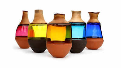
Stacking Vessel by Pia Wustenberg


Pia Wustenberg was born in Germany in 1986 and  at the age of 15 she moved to England for her final school years, followed by a foundation degree in Glass, Ceramic and Metal Design. This was followed by three years studying Furniture Design and Craftsmanship. In 2008 Pia graduated having spend her final year focused on wood construction in combination with other materials (ceramic, glass, leather). Pia did her postgraduate studies in Design Products at the Royal College of Arts, continuing her research into craft and materials in contemporary culture. London based, Piadesign, began new working collaborations with international clients and brands. In 2011 Pia set up her own company ‘Utopia & Utility’ for the promotion and production of her crafted designs.
Stacking Vessels is a series of functional sculptures for the home. Each Vessel consists of three individual containers. Each part is made from a different materials using craft processes. The hot glass is the connecting part between the ceramic and wood.


Wednesday, September 19, 2012

Taeko: a real japanese restaurant at ''Le marché des enfants rouges''


Hidden in the 3rd arrondissement in Paris, between Temple and Boulevard Beaumarchais, there is a covered market: Le marché des enfants rouges (Red children's market). Built in 1615, it supplied the close Marais. The neighbours decided this name in memory of the orphans who lived in the orphanage of the close square that used to wear red clothes as a sign of charity. In 1982 became an historical monument for Paris.
The market in a meltin' pot of cultures and you can have italian, lebanese, french, moroccan and japanese food. We went for japanese food because some friends told us it is one of the best in town. Such a lovely place where to have lunch, relaxed in the shade of the market and surrounded by smells from all over the world. I would definitely suggest to there, because you can actually taste a unique japanese cuisine: simple, tasty and delicious. 

Paper carving


Hélène Tamalet


Over is the title of an ensamble of pieces corresponding to a fictitious war, an act or even a game that could be the last. The meaning of this ambiguous and multiple preposition also leaves to think it is only the tip of the iceberg. Over is also the excess, surplus, the repetition that goes beyond, that passes over and through the reality. 
All of these pieces are born as a desire to play with elements inspired by the history and daily life,  to create a paradox and a world of fantasy battlefields. Hélène Tamalet's achievement, challenge and strength, are the leitmotiv. ''I often dream of a moving mountain, to govern an army ... from these dreams I give birth to shapes, objects sometimes resistent.'' The strategy is to balance, even to leave them confused, historical and popular symbols. The battle is innocent but actually declared.
I was amazed by the beautiful production of Hélène Tamalet: young, powerful, talented, provocative and inspiring. Each piece suggests a different scenario, with the same ironic still very serious statement. Every piece had been handmade by the artist and the quality was absolutely great. I wish good luck to this young artist who has all the qualities to become a master in this field.


Jorge Yeregui


Spanish architect and photographer Jorge Yeregui investigates minimum landscapes.
I really like the symmetry  of the lines in this picture in contrast with the natural shapes of plants. Moreover, the inside of this greenhouse building still seems real, while the exterior looks like a render. My personal interpretation of this minimum landscape is the greenhouse function that this building has. Plants, are not only decorative, but they live and grow protected by the glass walls. The symbiosis permits the plant to grow and give nice shade during the summer, and they will let the sun in during the winter. Don't really know what is this building function...but to me, looks like a meditative space, a covered square where to play and stay together.


Tuesday, September 18, 2012

Climate Revolution


Perfume bottles designers might like


Eight & Bob
This is a re-edition of a perfume from the '30 by Albert Fouquet. The story behind this perfume is funny: J.F.Kennedy smelled this perfume on Albert Fouquet during an event in Paris and he completely loved it. When he got back to the States he wrote a letter to the perfumer asking if he might have 8 bottles of perfume plus one for Bob. Eight & Bob was then named. Who arrived first with this packaging: Paper Passion or Eight & Bob?


Etat libre d'orange

Not only for the trasgressive concept and images that describe each perfume, but also for the fresh and contemporary graphic, Etat Libre d'Orange find a place in this chart. In particular Bijou Romantique, the brand new fragrance presented at Fragranze 10, a woody balmy lovely scent which reminds of a'' portrait of a lady. She can be seen in the feminine cameo, in the soft, delicate profile, in the dreamy image of an incandescent beauty. What once was shell has been carved in relief by a devoted artisan, to emerge as an idealized woman. Jewels, too...''